
The way light looks and behaves can influence mood, comfort, focus, and even sleep rhythms. This can matter both in daylight and in the artificial light we rely on – particularly in the evening and winter months.
This is relevant not only at home, but also in workplaces and shared environments, where lighting can affect comfort, inclusion, and how easy it is for people to do their best work.
This article introduces four aspects of lighting quality that many people notice – especially those who are more sensitive to light – in a gentle, non-technical way.
Whether you’re at home in winter, setting up a workspace, or thinking about how people feel in shared environments, understanding these lighting qualities can lift insight without overthinking.
Colour temperature: warm, cool, and everything in between
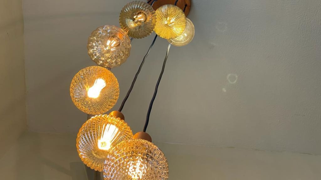
Light has a ‘tone’ that ranges from warm (more yellow/red) to cool (more blue). This is measured in Kelvin (K) and often described simply as “warm white” or “cool white”.
- Warm light (eg ~2700–3000K) feels cosy and relaxing – similar to traditional incandescent bulbs.
- Cooler light (eg ~4000–5000K and above) can feel clearer and more alerting, similar to natural midday daylight.
Neither is better universally – it depends on the time of day, the task at hand, and what feels right for you.
Cooler light can be helpful in daytime workspaces, kitchens and bathrooms where visual clarity matters. In the evening, however, it can feel harsh or over-stimulating when we’re trying to wind down.
Warmer tones often support cosy, social or restful spaces, making them a good fit for living rooms, bedrooms, or collaboration and break spaces in the workplace.
Brightness (intensity): too much, too little, or just right
Brightness is about how much light is delivered to a space. Too little can feel dim and heavy; too much can feel glaring and fatiguing.
In homes, brightness that matches the task at hand – brighter for working, reading or cooking, and softer for relaxing – often feels more comfortable than one constant level all day.
The same principle applies in workplaces. Extra task lighting can support focused or detailed work, while slightly lower or softer lighting may feel more comfortable in spaces used for collaboration, reflection or breaks.
Many people with light sensitivity describe discomfort when light is very intense or contrasts strongly with surrounding areas, as this can make it harder for the eyes and nervous system to adjust comfortably.
Flicker and temporal light artefacts: often invisible but impactful
Even when a light looks steady, it can be fluctuating rapidly. This is known as flicker or a temporal light artefact.
Flicker can:
- Contribute to eyestrain
- Aggravate migraines
- Interfere with comfort in some people, particularly those with light sensitivity
With some LED lighting, the way a bulb is driven electronically can introduce flicker that isn’t consciously visible but is physiologically felt. People who are sensitive often notice relief when they choose light sources designed to minimise flicker.
Colour Rendering Index (CRI): how ‘true’ colours feel
CRI is a measure of how accurately a light source reveals colours compared with natural daylight.
A higher CRI (closer to 100) usually means colours appear more natural and balanced. Lower CRI lighting can make colours look washed out or “off”, which can subtly affect visual comfort.
In both living and working spaces – especially where colour perception matters (such as art, décor, skin tones or food) – many people find that higher CRI lighting feels more familiar and less visually tiring.
Light sensitivity and lived experience
While most people can tolerate a broad range of lighting, some experience real discomfort or health impacts from certain lighting conditions – including flicker, glare, harsh colour temperatures, or intense brightness.
The UK charity LightAware offers support and advocacy for people with light sensitivity, including information on how modern lighting technologies can affect health and daily life, why some people are affected more than others, and how environments can be managed more thoughtfully.
LightAware’s resources can be especially useful if:
- Standard LED lighting feels uncomfortable
- Flicker or glare triggers symptoms
- Public or shared lighting causes difficulty
- You want to understand more about how environments influence wellbeing
You can visit LightAware.org for guides, explanations and real-world support.
A simple way to use this understanding
You don’t need to master any of this. These ideas are simply tools to help you notice patterns and make choices that feel supportive in your home or workplace.
You might try:
- Experimenting with warmer tones in living spaces, bedrooms, or break and collaboration areas.
- Choosing lights with higher CRI where colour feels important.
- Noticing whether flicker correlates with discomfort or fatigue.
- Adjusting brightness across the day rather than using one level all the time.
Rather than thinking of light as right or wrong – or creating rules – it can be helpful to think of it as dynamic. Is it supporting your body, the task you’re doing, and how you want to feel in that space at that moment?
Light is something we often don’t think about, yet it can quietly support – or detract from – mood, comfort and energy. Being aware of lighting quality gives you language for noticing and intention for shaping spaces that support wellbeing, without needing to overthink it.
Further reading
This article draws on evidence about how lighting in homes and everyday environments can influence circadian rhythms, comfort, glare, flicker and colour perception, alongside scientific consensus statements on light and public health.